
Bitcoin (BTC) consolidates within its range, causing many investors to become impatient. In this on-chain analysis, we explore a method of market sentiment analysis derived from studying the correlations between altcoins, Bitcoin and Ether.
Bitcoin (BTC) consolidates within its range
Bitcoin (BTC) price fluctuations are tightening around the EMA 21. Still trading within the range established since January, the price is sideways, pushing volatility down to yearly lows.
With the exception of a few altcoins, the entire crypto-currency market, which is highly correlated to the movements of BTC and ETH, is struggling to show signs of life and is testing the patience of participants.
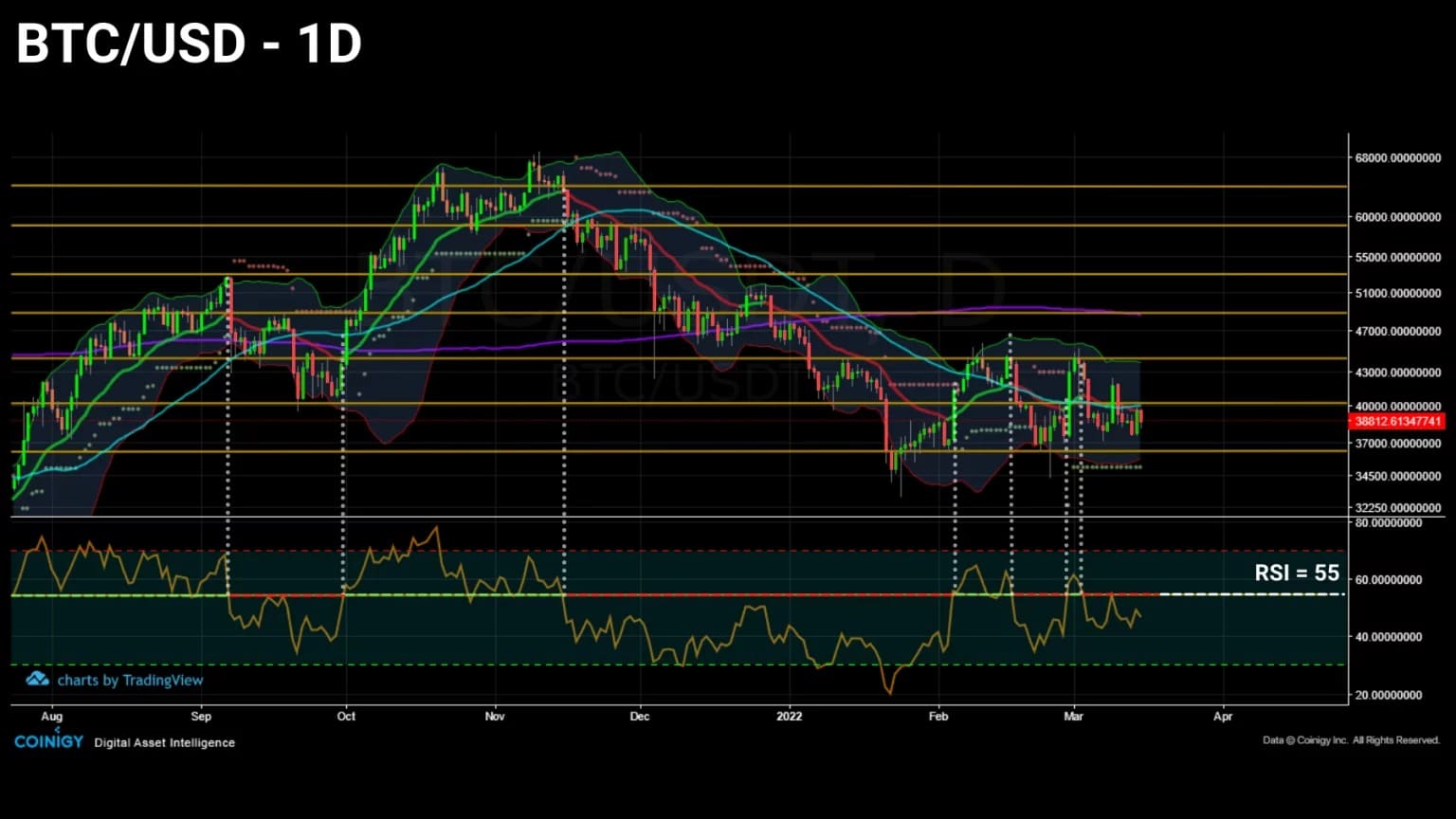
Figure 1: Daily price of bitcoin (BTC)
This week, we will attempt to define global market sentiment using a model developed by Data Always before estimating investor engagement by studying their use of the Bitcoin network.
Correlations unique to the crypto-currency market
As we noted in our previous analysis, the correlation between bitcoin and the S&P500 is gradually falling from its recent highs, indicating a potential decorrelation of the crypto-currency sector with traditional financial indices in the coming weeks.
While the correlation between the two ecosystems is receding and provides insight into bitcoin’s reaction to external macroeconomic and geopolitical events, let’s look at the relationship between the various components within the crypto-currency sector itself.
As we shall see, the reactions of the major crypto-assets to the bitcoin (BTC) and ether (ETH) prices seem to contain relevant information about the nature of market sentiment.
Below are the market capitalization trends of BTC, ETH and the other crypto-currencies in the market, grouped under the label “TOTAL 3”.
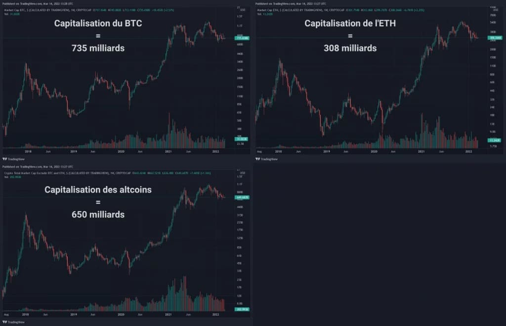
Figure 2: Market caps of bitcoin, ether and altcoins
At first glance, we can see that all three curves follow a very similar trajectory despite fluctuating in magnitude.
This relationship is explained by dataalways as a consequence of an undifferentiated flow of capital being offered to the majority of crypto-currencies without any particular selection criteria.
“Crypto-currencies are highly correlated risk assets. Each token has a specific strength from which it derives some of its value, but with a large flow of fiat towards this asset class, […] the blind flow of capital injected into valuable and worthless protocols reinforces the high correlations within the ecosystem. “
Indeed, while many investors use fundamental analysis before investing, a broader dynamic is taking shape in the background: we are witnessing one of the greatest sectoral value transfers of our century in our lifetime.
Leaving traditional finance to feed the crypto-currency sector, waves of capital are pouring in and trickling down to many projects, regardless of value or fundamental utility to the ecosystem.
With this contextualisation in place, we can then proceed to study the internal correlations specific to the sector.
Analysis of market sentiment
In order to best capture the dynamics linking the two largest capitalisations (BTC and ETH) to the rest of the ecosystem, the correlations of the top 25 altcoins were aggregated as an average, as shown below.
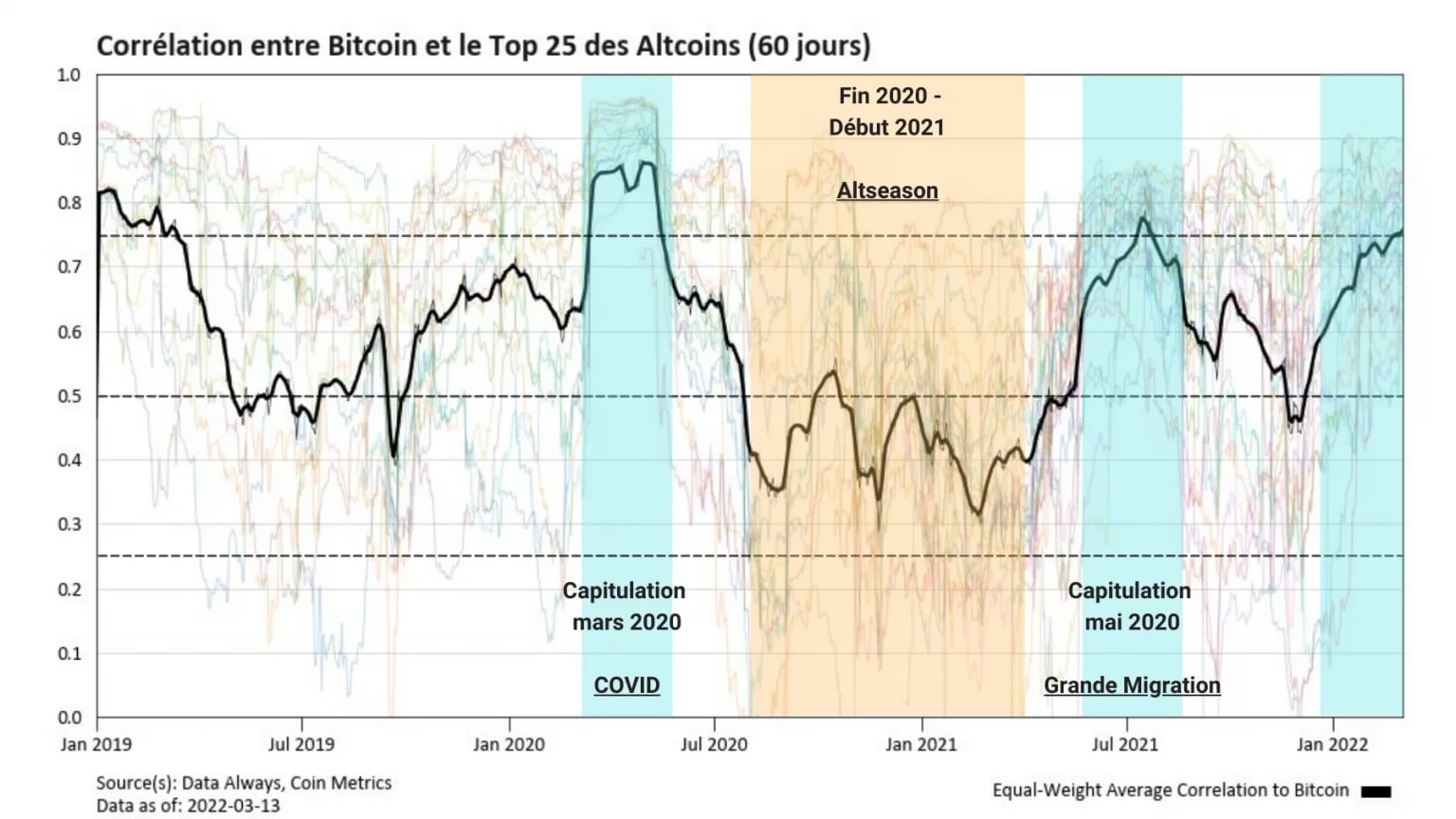
Figure 3: Correlation between BTC and the Top 25 altcoins
We can therefore observe that, in general, altcoins are positively correlated to BTC, confirming its role as a market leader.
However, this chart highlights periods of increased correlation (blue), occurring notably during major capitulations, such as in March 2020 or May 2021.
During these periods, the BTC price pushes the whole market down and altcoins, largely following its fluctuations, fall drastically, among others because of their low capitalisation.
Recently, it appears that the whole market is following the dynamics of BTC assiduously, in a correction phase since its ATH in November 2021 and then in consolidation since February.
Conversely, there are periods of neutral or even negative correlation (yellow), during which altcoins begin a dynamic close to that of ether, such as at the beginning of 2021, during an event known as “altseason”.
To make it clearer, the following chart represents the correlation between the top 25 altcoins and the ETH price.
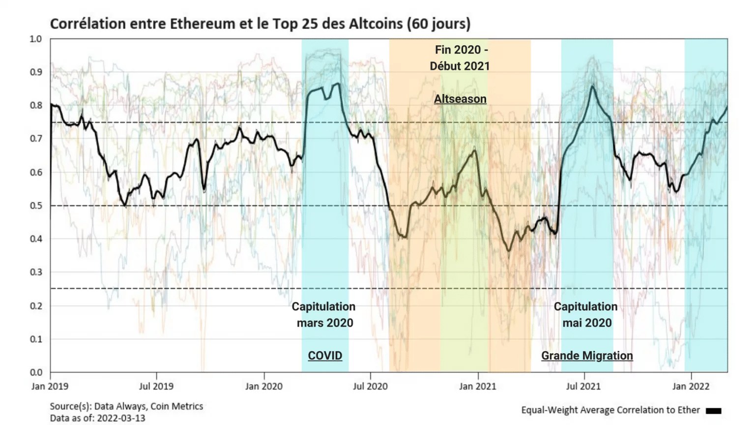
Figure 4: Correlation between ETH and Top 25 altcoins
While there is an obvious similarity with the previous chart, it should be noted that the correlation between altcoins and ETH is statistically higher than that of BTC. The neutrality threshold in this chart should therefore be reconsidered slightly upwards.
Furthermore, it is important to mention that this data has a reactive value and is not predictive. Thus, they do not predict the direction of a trend, but rather indicate where it is, acting more like a compass than a crystal ball.
However, one difference is obvious from this chart: altcoins tend to follow the ETH price rather than the BTC price in early 2021 (green), confirming the altseason thesis mentioned above.
But there is more to these two charts than meets the eye. To go further, instead of looking at the absolute change in correlations, let’s focus on the widening and narrowing of the difference between the correlation functions.
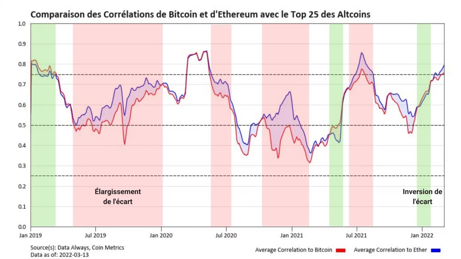
Figure 5: Comparison of BTC and ETH correlations with the Top 25 altcoins
This new chart overlays the correlation curves studied above to highlight the width of the gap between them, as well as its evolution over time.
It is then that a new behaviour appears. We can clearly identify periods of widening (red) and inversion (green) of the gap between the two correlations.
It is then legitimate to question the significance of these two states. The interpretation of these periods is as follows:
- The widening of the spread in favour of BTC indicates that the market has less appetite for risk, with bitcoin leading particularly well during declines. Such an event can lead to a drop in the price of most tokens subject to correlation.
- The widening of the spread in favour of ETH, resulting in a reversal of the signal, means that the market is more risk averse and may lead to a price increase.
- The narrowing of the spread indicates a transition to a neutral position where the altcoins follow BTC and ETH in the same way.
Since BTC and ETH are highly correlated assets, changes in spread perceived as small (in the range of 0.05 to 0.2), however, indicate a significant change in risk profile.
As dataalways states:
A spread that widens to 0.2 is a sign of extreme risk-taking behaviour, while any reversal should be taken as a signal that fear is driving the market.
We can finally model the variation of this spread as a curve to get an overview of the overall market sentiment over a given time period.
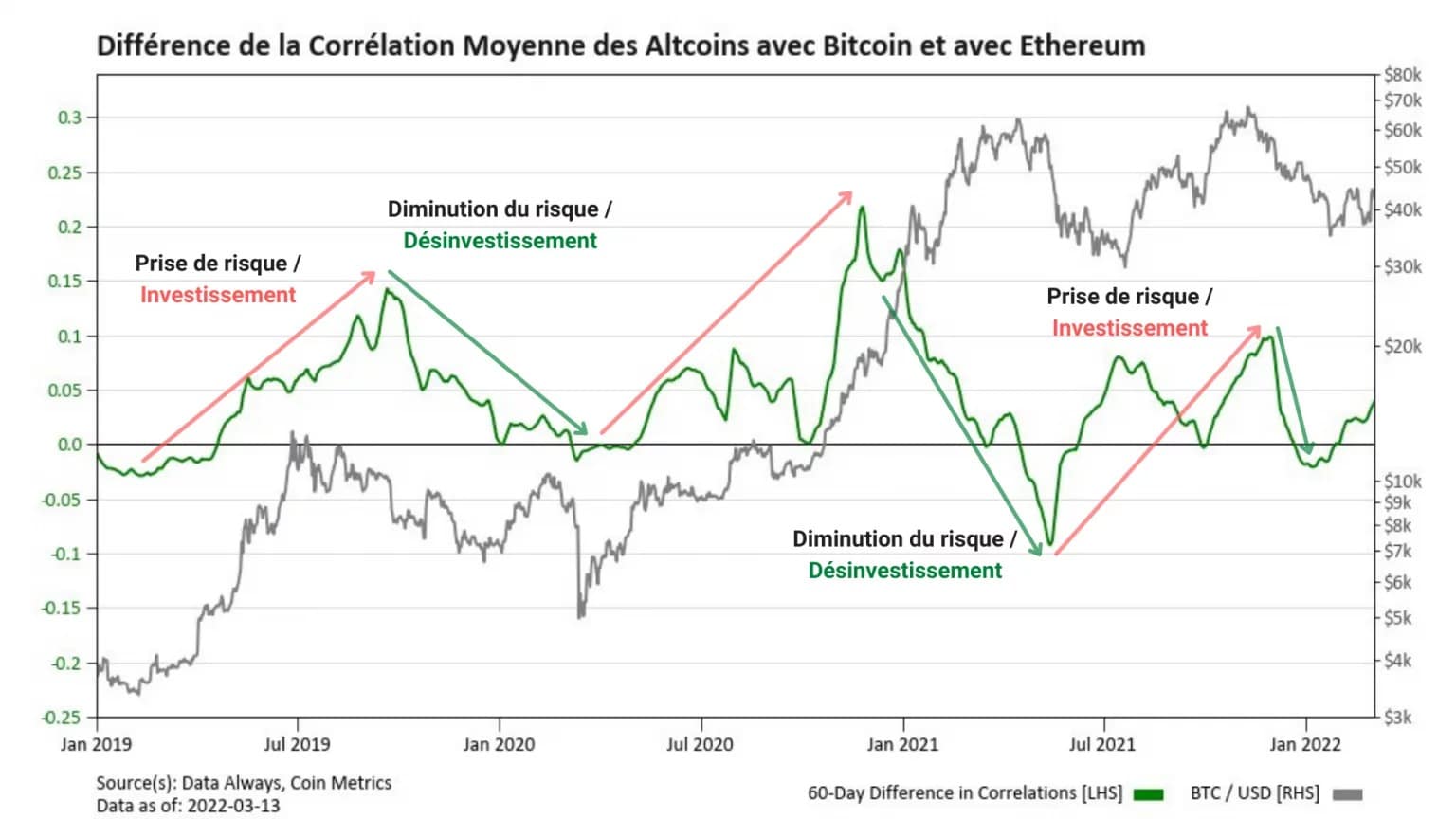
Figure 6: Difference in average correlation of the Top 25 altcoins with BTC and ETH
This chart, based on the difference in the average correlation of altcoins with bitcoin and ether, clearly shows several distinct phases.
A rise (red) indicates a gap in favour of ETH, a sign of risk appetite, while a fall (green) indicates that BTC is regaining the upper hand over the other market components, often during corrective phases, accompanied by large-scale disinvestment.
Thus, following the risk-off phase that began in December 2021, the market now appears to be entering a new investment period, signalled by a widening spread in favour of ETH.
The Bitcoin network is still under pressure
While the analysis of the underlying trends via altcoin correlations indicates that the market is once again taking the risk to invest, the on-chain activity of the Bitcoin network allows us to qualify the statement.
Indeed, as mentioned in previous analyses, on-chain activity, a proxy for participant engagement, is far from peaking.
If we look at the number of new entities making their first transaction on the network, the moderate increase since July 2021 clearly indicates a timid, albeit present, commitment.
The market is indeed welcoming new entrants, but at a much reduced pace if we compare it to the new influx of entities that took place from the beginning of 2020.
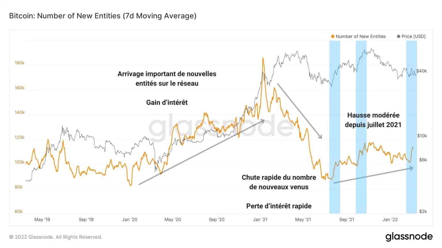
Figure 7: Number of New Entities
It also appears that the number of transactions carried out daily on the network has not benefited from the moderate influx of new entities.
Currently processing less than 225,000 daily transactions, the network now processes as many transfers as it did at the time of the March 2020 surrender.
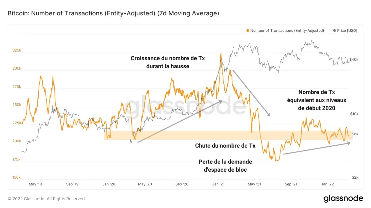
Figure 8: Number of Transactions
This lack of demand for block space from participants is clearly visible in the daily transfer volume graph.
While the Bitcoin network totaled more than $10 billion in transfer volume near the highs of 2021, a loss of commitment was felt from May to November 2021 and again from January to the present.
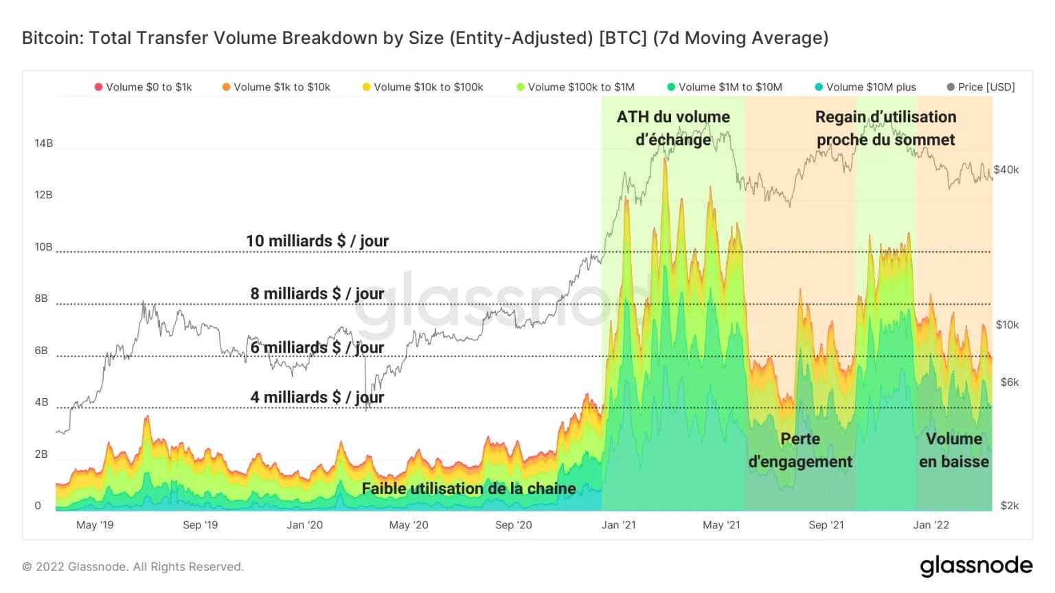
Figure 9: Total Transfer Volume
This observation is corroborated by the total transaction costs of the exchanges, which have literally collapsed following the May 2021 sell-off.
An indicator of the propensity of participants to use the services of exchange platforms to invest or disinvest their capital, this metric dramatically signals the absence of economic activity on exchanges.
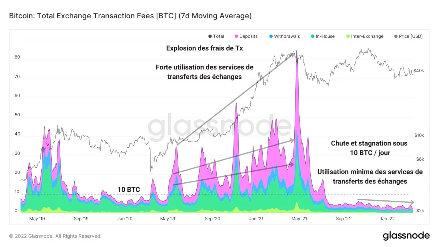
Figure 10: Exchange transaction costs
Finally, in order to best gauge the low demand for block space, the Mempool study provides a definitive statement.
The curve below represents the number of transactions entering the Mempool per second. The curve below shows the number of transactions entering the Mempool per second, which has been falling structurally since 2019, indicating that fewer and fewer transactions are entering the Mempool.
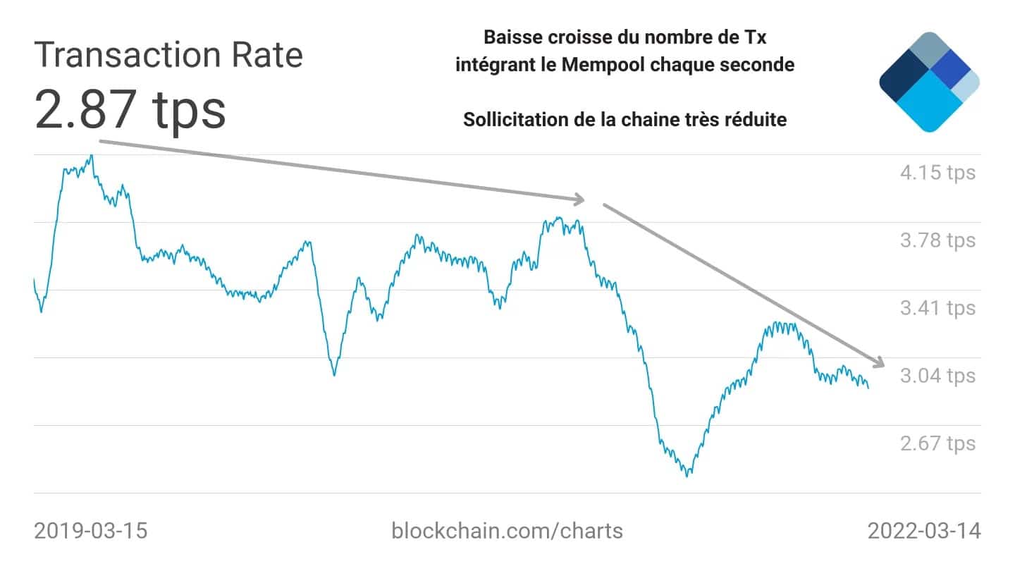
Figure 11: Rate of transactions entering the Mempool
A sign that the demand on the chain is sufficiently low that this “queue” is gradually emptying, this observation further supports the fact that investor engagement is not palpable.
This does not mean that the entities present are not active. It indicates that, overall, the Bitcoin network is much less engaged today and that there is no sign of a sustained return of participant engagement.
Summary of this on-chain analysis
Finally, our study of the internal correlations of the crypto-currency sector allows us to highlight the behaviour of the market’s risk profile according to the relationships between altcoins, bitcoin and ether.
Beginning a trend since the start of 2022 indicating a return to risk-taking, investors appear to be regaining a form of optimism, signalled by a widening spread in favour of ETH.
However, our analysis of on-chain activity shows that participants’ commitment to the chain still leaves something to be desired. The lack of significant economic activity on the exchanges and a decline in transfer volume indicates that the market is not experiencing a sustained return of activity.