
What to expect from the Bitcoin (BTC) price in 2022? While it is difficult to predict future market movements, let’s look at the context that 2021 leaves us in order to take a global view of market dynamics.
An uncertain start to the year for Bitcoin
How many see the start of 2022 as a damp squib for the cryptocurrency market?
Bitcoin, having just broken through $46,500 support, is performing worse than expected, a fact interpreted by many analysts as a sign of market weakness.
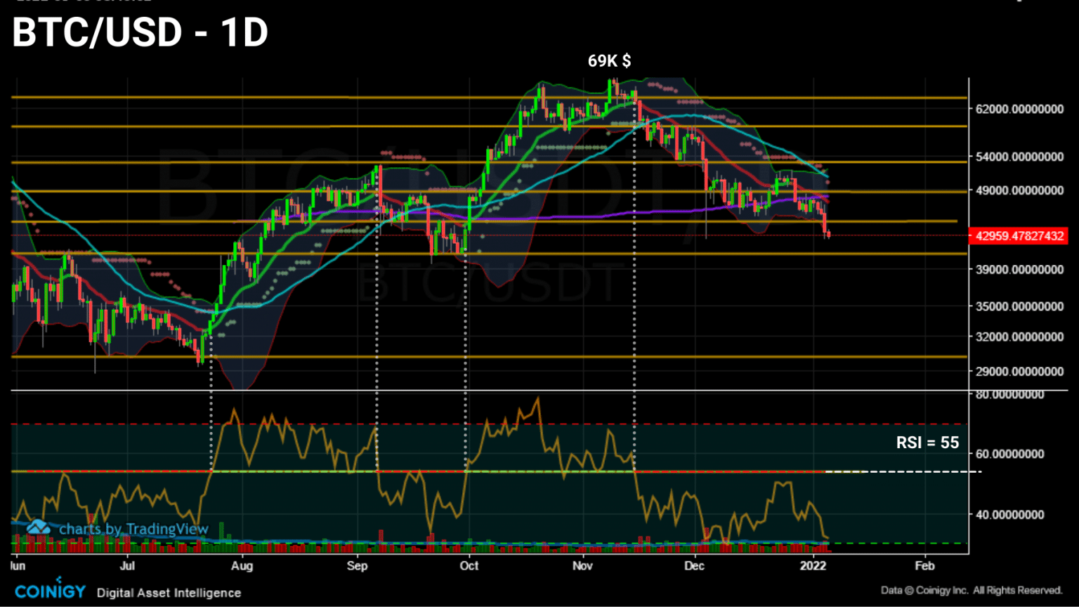
Daily chart of bitcoin (BTC) price (Source: Coinigy)
Flirting with $43,000 following a new wave of long liquidations, the short-term price action of bitcoin (BTC) may have many doubting it.
What to expect from this indecisive and erratic price action? While it is difficult to predict future market movements, we can at least study the context in which bitcoin (BTC) is trading in order to take a comprehensive view of market dynamics.
In order to better understand the behaviour of the Bitcoin network and its native token BTC at the start of this year, let’s take a look at the evolution of the profitability of BTC token spending and maturation, before taking the pulse of the network’s vital signs in a forthcoming publication.
Spending profitability dynamics
Let’s start our study by looking at the profits and losses made on the channel over the last few months.
Reflecting the spending behaviour of the participants, the graph below represents the evolution of successful (green) and unsuccessful (red) spending over time.
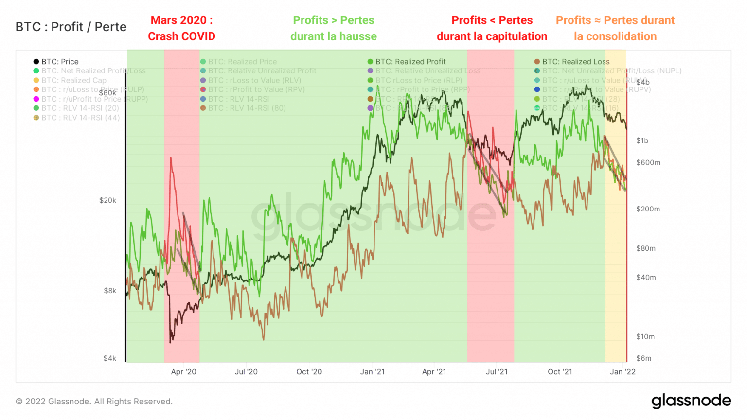
Graph of realized bitcoin (BTC) profits and losses (Source: Glassnode)
We can identify several distinct periods during the years 2020 and 2021.
March to April 2020: Following announcements of a pandemic, the markets panic and take BTC down with them. Losses far exceeded gains and many participants gave up their strong hand tokens (LTH) by selling at a loss.
May 2020 to April 2021: BTC breaks out of its former ATH ($20,000) and begins a powerful upward phase. Realized gains accelerate and then far exceed realized losses as LTH realizes some of its profits.
May to mid-July 2021: Demand is no longer sufficient to sustain the selling pressure of strong hands. A major event known as the “Great Migration” causes market participants to panic. High bearish volatility sets in and forces some players to make losses as the market capitulates and then consolidates at the $30,000 level.
August to December 2021: The market resumes its rise forming curved tops similar to the April market top. A period of moderate profit taking sets in as BTC forms a new high near $69,000.
December 2021 to early January 2022: Following a cascade of liquidations from the derivatives markets, the market corrects and enters a range between $52,000 and $46,500. Profits and losses converge to the downside, indicating that the market has not yet made a decision on the trend to follow.
Highlighting these periods allows us to gauge the profitability of the market at any given time and thus identify buying or selling opportunities.
By dividing the realised value of a UTxO at destruction by the value at creation, aSOPR takes the research a step further by allowing us to quantify the profitability status of the tokens deposited over a given time period.
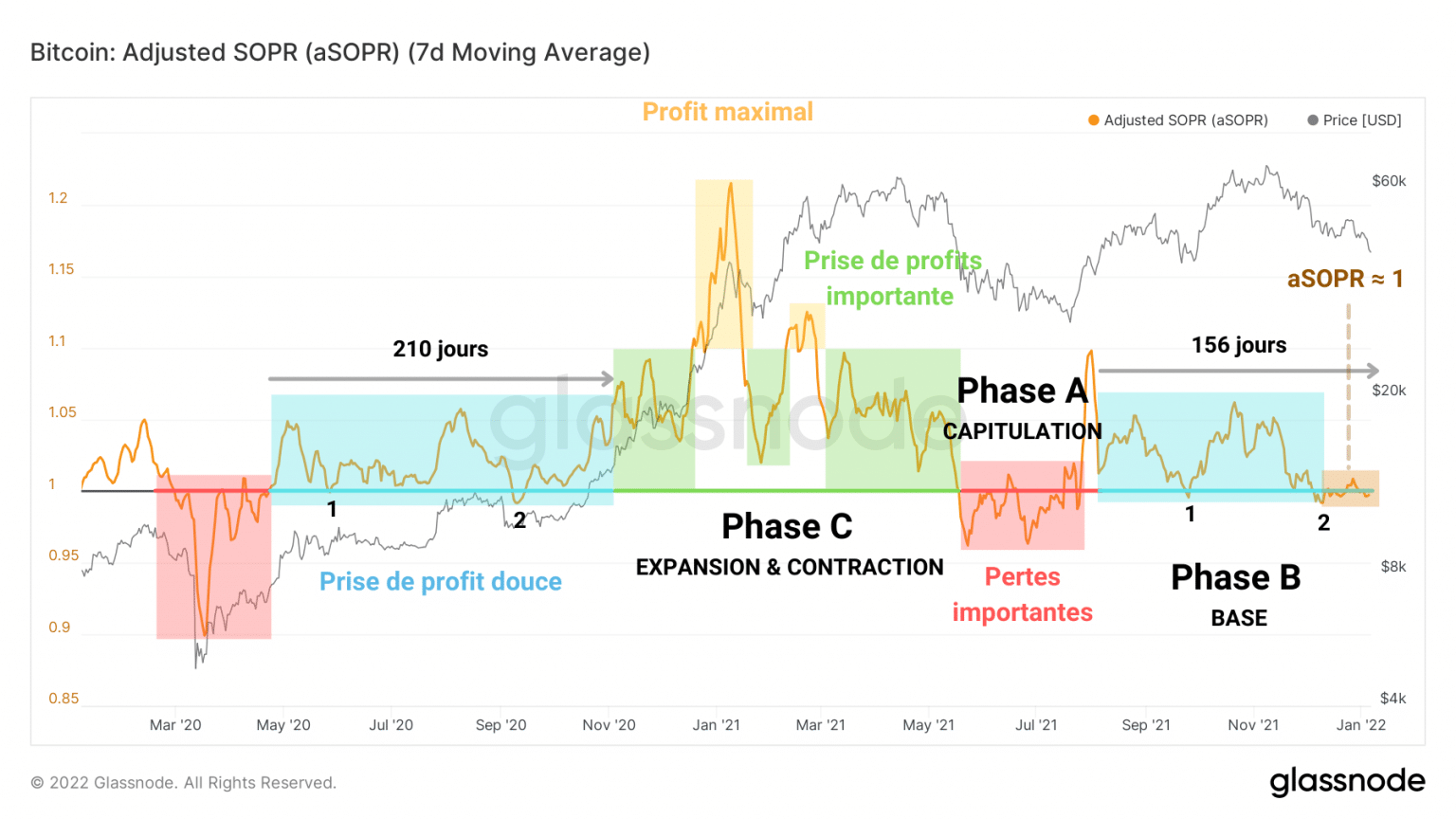
Graph of bitcoin (BTC) aSOPR (Source: Glassnode)
This ratio separates the periods observed above into three phases.
Phase A – Capitulation: Tokens are sold below their base cost (aSOPR ☻ 1), large losses are realized (red) as the BTC price falls.
Phase B – Baseline: Neutral spending (aSOPR ≈ 1) or moderately profitable (blue). This period precedes strong bullish impulses and euphoria phases.
Phase C – Expansion and Contraction: The market accelerates upwards while participants make increasing gains (green) until maximum profit taking (yellow). This is followed by a decline in profitability which can lead to the market capitulating.
Forming a base for the past three weeks, the aSOPR prints values close to 1, a sign that the tokens sold are very close to their base cost.
For a healthy rally to build, it would be ideal to see the aSOPR break out of its neutral zone and test it as support to begin a C phase.
Otherwise, the aSOPR could dip below 1, which should act as resistance if the market capitulates.
The study of realised losses tells us that a strong period of negative profitability cannot be ruled out.
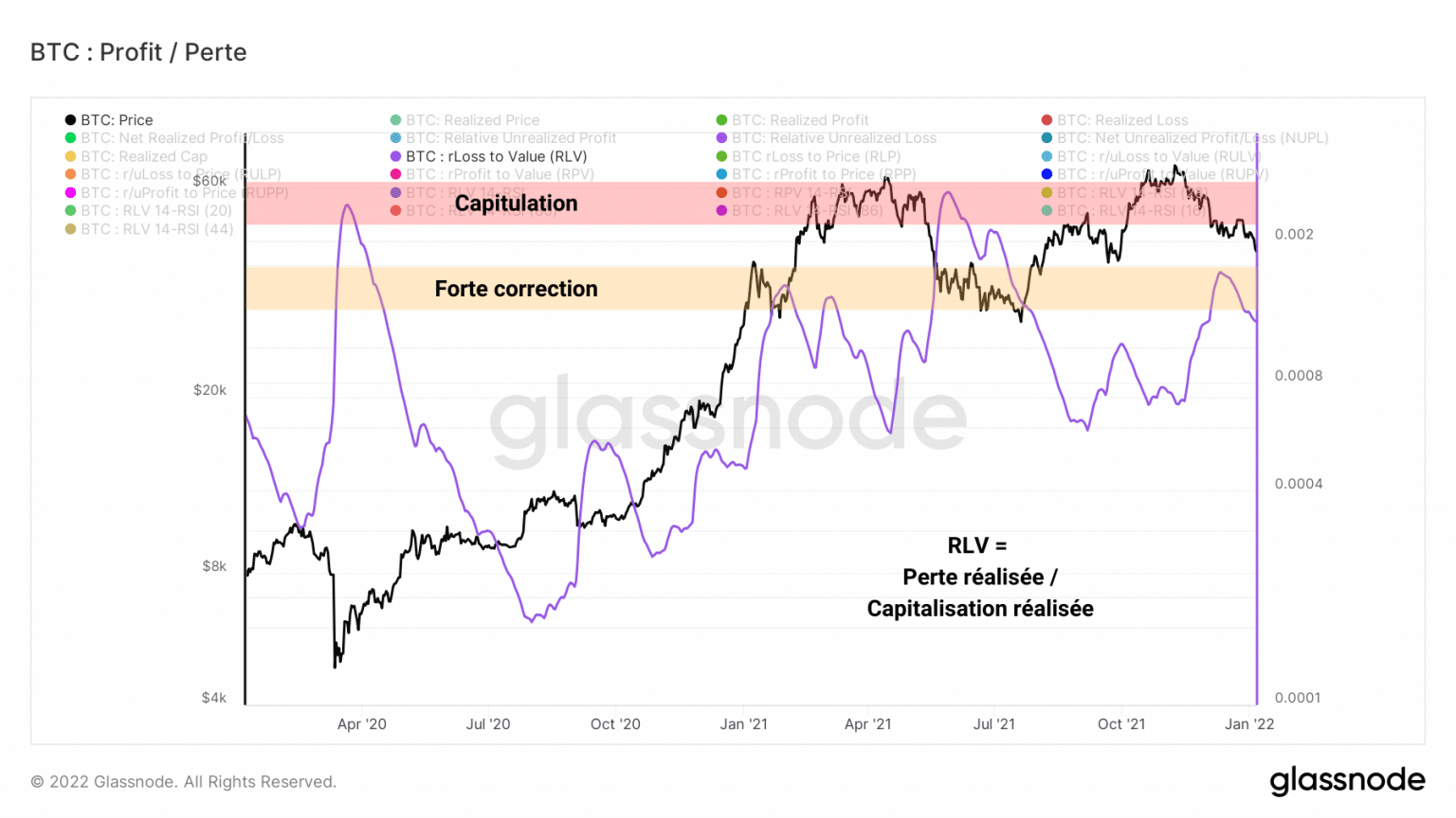
Bitcoin (BTC) RLV ratio chart (Source: Glassnode)
Following our observations of 17 December, the RLV ratio, weighting the realised losses by the realised value of the market, indicates that the pain suffered by investors is less severe than during the capitulation events of March 2020 and May 2021.
We will need to be careful not to see this ratio increase over the next few weeks if we expect a resumption of the rise in the price of BTC.
BTC token maturation dynamics
With respect to token maturation, the last few months have provided us with a classic case study that we will review together.
When a UTXO is created, it accumulates what are called token days (TDs) as it ages and matures. When this UTXO is spent, its JJ count is destroyed and reset to zero. This is called rejuvenation.
The graph below shows the evolution of the count of destroyed days (DD) over a given period.
Following a destruction phase indicating a coordinated spending of old tokens at the end of 2020, the market has seen two declines in the JJD count, a sign that tokens are remaining dormant and maturing.
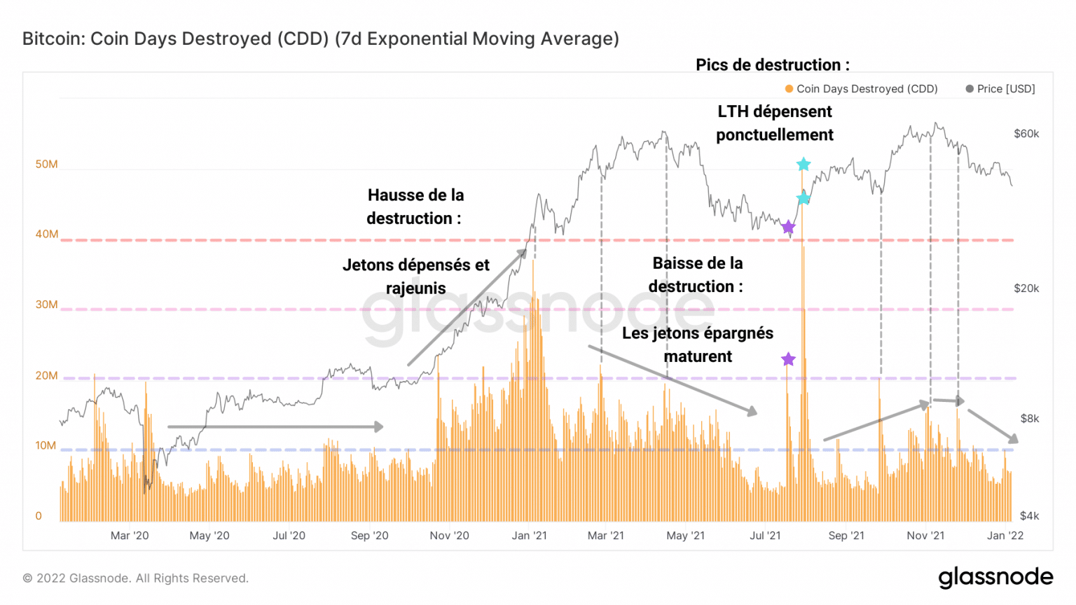
Bitcoin (BTC) JJD count chart (Source: Glassnode)
It appears that the rejuvenation phases of old chips coincide with the printing of new highs, as the rising price encourages strong hands to realise the gains of their dormant chips for several months, sometimes years.
One step further, liveliness allows us to understand how JJDs evolve in relation to JJs created through maturation.
This indicator, defined as the ratio of JJDs to the sum of JJs that have never been created, allows us to define the rate of rejuvenation or maturation of the tokens.
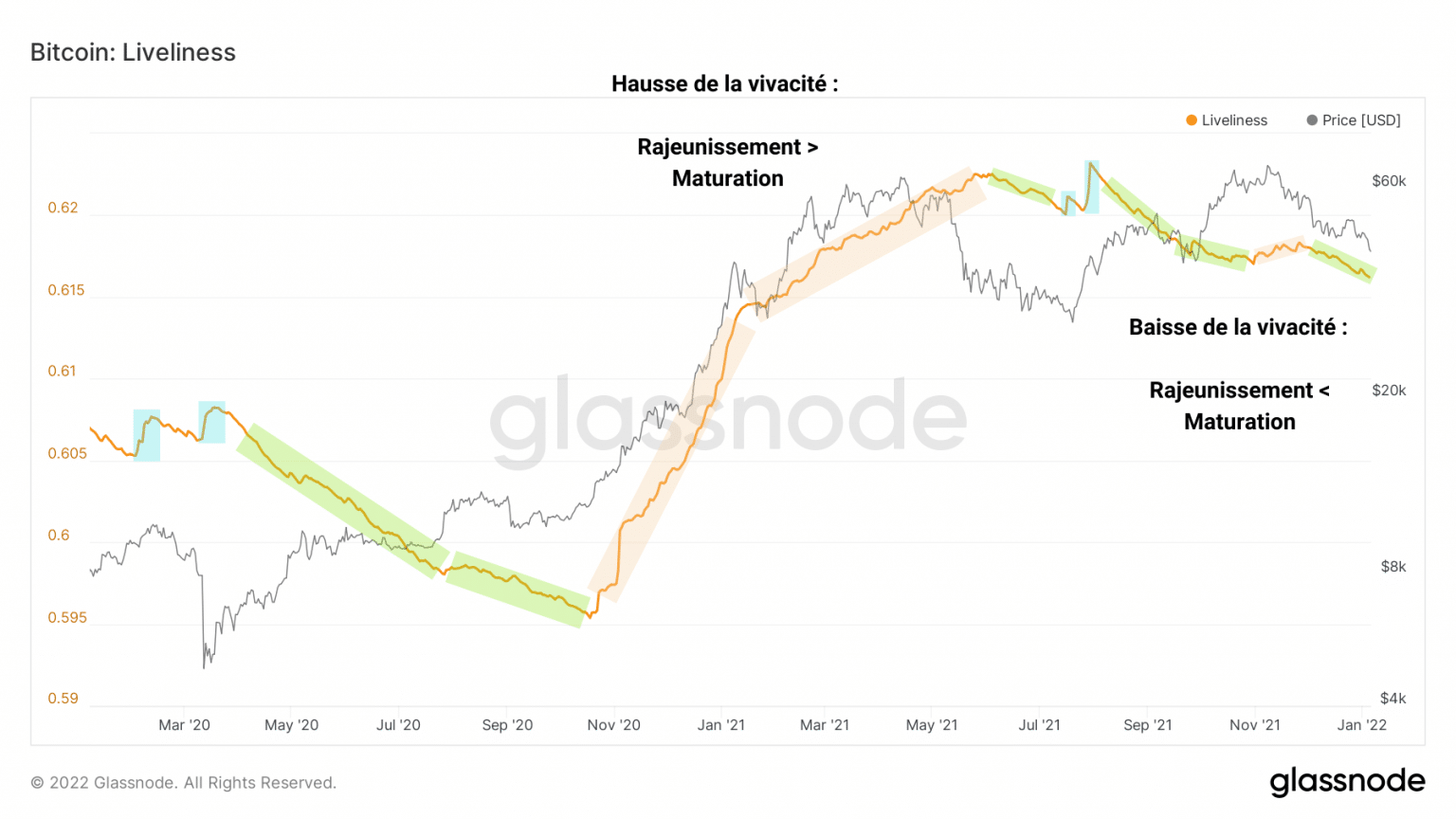
Bitcoin (BTC) liveliness graph (Source: Glassnode)
Thus, from November 2020 to May 2021, rejuvenation (beige) takes precedence as the price of BTC rises and then slows before correcting.
Several periods of maturation (green) then begin, during which most of the tokens on the chain mature.
Moreover, these maturation/rejuvenation dynamics coincide with the accumulation/distribution periods of the cohorts that we have been observing since November, visible through the HODL waves.
This metric represents the age of all existing BTC tokens in the form of bands, which as they become thicker or thinner, form identifiable trend waves.
Let’s split this metric in two:
- On the one hand, chips older than 6 months, in cold colour, are held by LTHs and are less likely to be sold due to market pressure
- On the other hand, tokens less than 6 months old, symbolising STHs with warm colours, are more sensitive to volatility and emotionality.
Here again, we can detect the behaviour of long-term investors via the evolution of the age of the tokens.
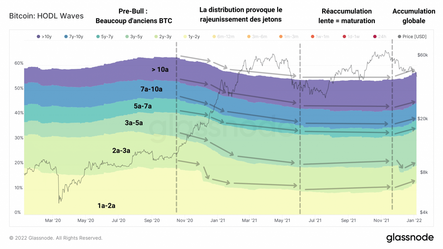
Chart of bitcoin (BTC) HODL waves over 6 months (Source: Glassnode)
By November 2020, waves of HODL above 6 months have adopted a downward trend, a sign of the distribution of tokens from LTH to STH.
It is during this phase that the JJ count of spent BTC falls to zero as strong hands make large profits.
During the May capitulation, these long-sighted participants will then accumulate the same chips sold at low prices by short term traders who bought near the top.
The maturation process resumes before a minority of LTHs sell their BTC near the new ATH in November.
This selling pressure is mixed, however, given the fact that liveliness is declining, as noted above.
The behaviour of investors in the short term, often the opposite of that of LTHs, corroborates this fact.
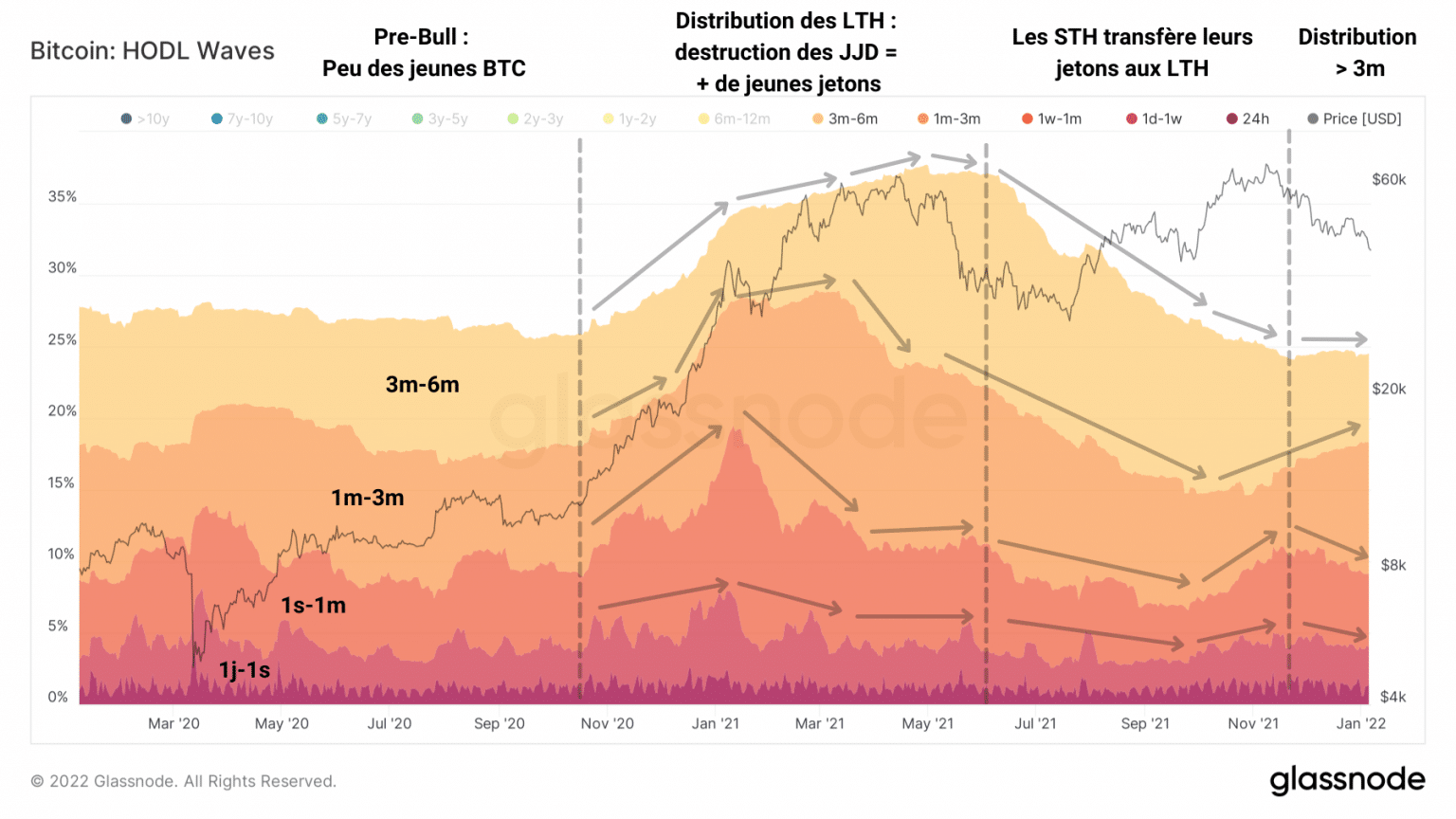
Chart of bitcoin (BTC) sub-6 month HODL waves (Source: Glassnode)
Although the bands corresponding to tokens less than three months old are declining, the upper bands continue to grow, a sign that many tokens are maturing and crossing the age bands, evolving towards cooler colours.
So, after LTHs took some profits in November, STHs who bought tokens in the last three months participated in the December selling pressure, along with speculators in the derivatives markets.
Synthesis
Overall, it appears that profits and losses are overlapping without a clear direction being fully validated. The state of profitability is at a standstill and will require close attention in the coming weeks.
Since December, a partial distribution has been taking place without this momentum denting the greedy accumulation of participants from all cohorts. Despite the unattractive price action, many are holding on to their chips and proving their conviction