
What to expect from the Bitcoin (BTC) price in 2022? While it is difficult to predict future market movements, let’s continue our study of the market dynamics inherited from the year 2021 to take a step back from the current price action.
Bitcoin (BTC) rebounds to $40,000.
After rejecting $40,000 support three times, the price of bitcoin (BTC) is going to have to break through a lot of technical resistance before resuming a sustained rise.
Currently on course to reclaim the 21stMA (red), BTC is still within a correction of the order of over 35% since the new ATH of $69,000.
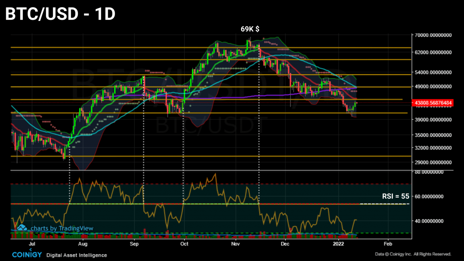
Daily Bitcoin (BTC) price chart (Source: Coinigy)
Continuing our global study of market dynamics, let’s add the health of the Bitcoin network and the behavior of exchange flows and their relationship to the BTC price to our prism today to see a wide range of metrics as we move into 2022.
Network health
Let’s start by looking at how much the Bitcoin network has grown in recent months.
The hash rate, the computational power needed to produce a new block, has been structurally increasing since 2020 and then plunging in May 2021.
This event, known as the “Great Migration”, is due to the exodus of miners located in China.
Forced to unplug their machines in search of a more lenient jurisdiction, these entities also had to liquidate part of their BTC in order to finance their relocation.
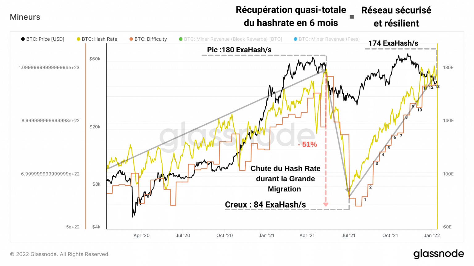
Bitcoin (BTC) hashrate graph (Source: Glassnode)
The result: these miners, who have mostly relocated to Texas or Kazakhstan, have caused a 51% drop in hashrate.
However, it will take more to bring down the global distributed network, which quickly recovered from this logistical attack.
Indeed, eight months and twelve positive adjustments to the mining difficulty later, the hashrate is approaching its ATH and is once again demonstrating its resilience.
Yet, while miners are busy securing Bitcoin, one of the sliders to its adoption lies in the entry of new entities into the network.
Using the number of active addresses and the number of new addresses created, we can obtain an acceptable proxy for the overall trend in participant engagement.
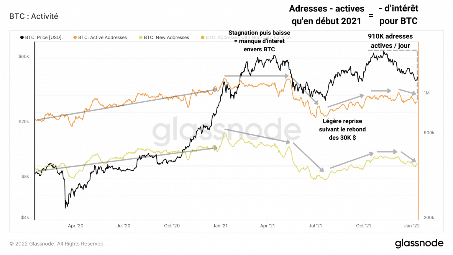
Bitcoin (BTC) active address graph (Source: Glassnode)
It seems then that the rate of new entrants has been declining since the May surrender. Ditto for pre-existing active addresses.
This indicates a lack of interest in bitcoin among participants, a sign that 2021 was not a particularly prolific year in terms of organic adoption.
However, we can qualify this by the fact that large companies such as MicroStrategy, Grayscale or nations such as El Salvador still entered the market with the firm intention of staying.
Corroborating this lack of interest, the number of transactions on the blockchain has been structurally declining since the beginning of 2021.
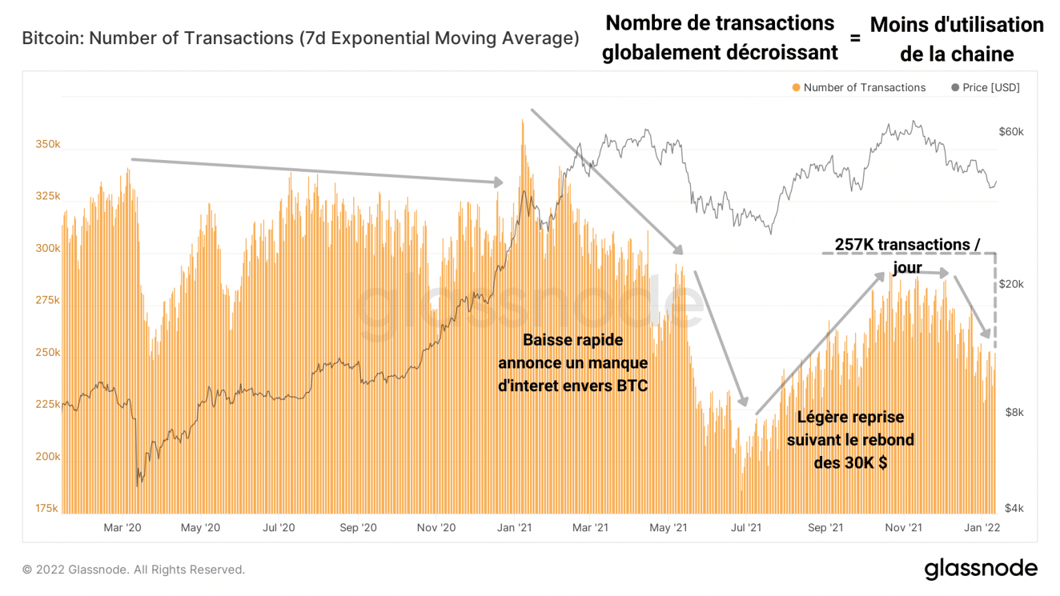
Graph of Bitcoin (BTC) transactions (Source: Glassnode)
In addition to not experiencing significant growth, the network is also being used less and less by existing market participants.
It is likely that the May capitulation has driven out many entities, which are not yet ready to return to the market.
The unprecedented price action of the year 2021, marking the introduction of curved peaks and troughs close to the Wyckoff distribution and accumulation patterns, also played a major role in sowing doubt among some players, unaccustomed to this type of dynamics.
However, it seems that this lack of interest has not prevented the network from allowing the transfer of large volumes of capital. In fact, the increasing volume of transfers tells us that more and more funds are being sent on the chain.
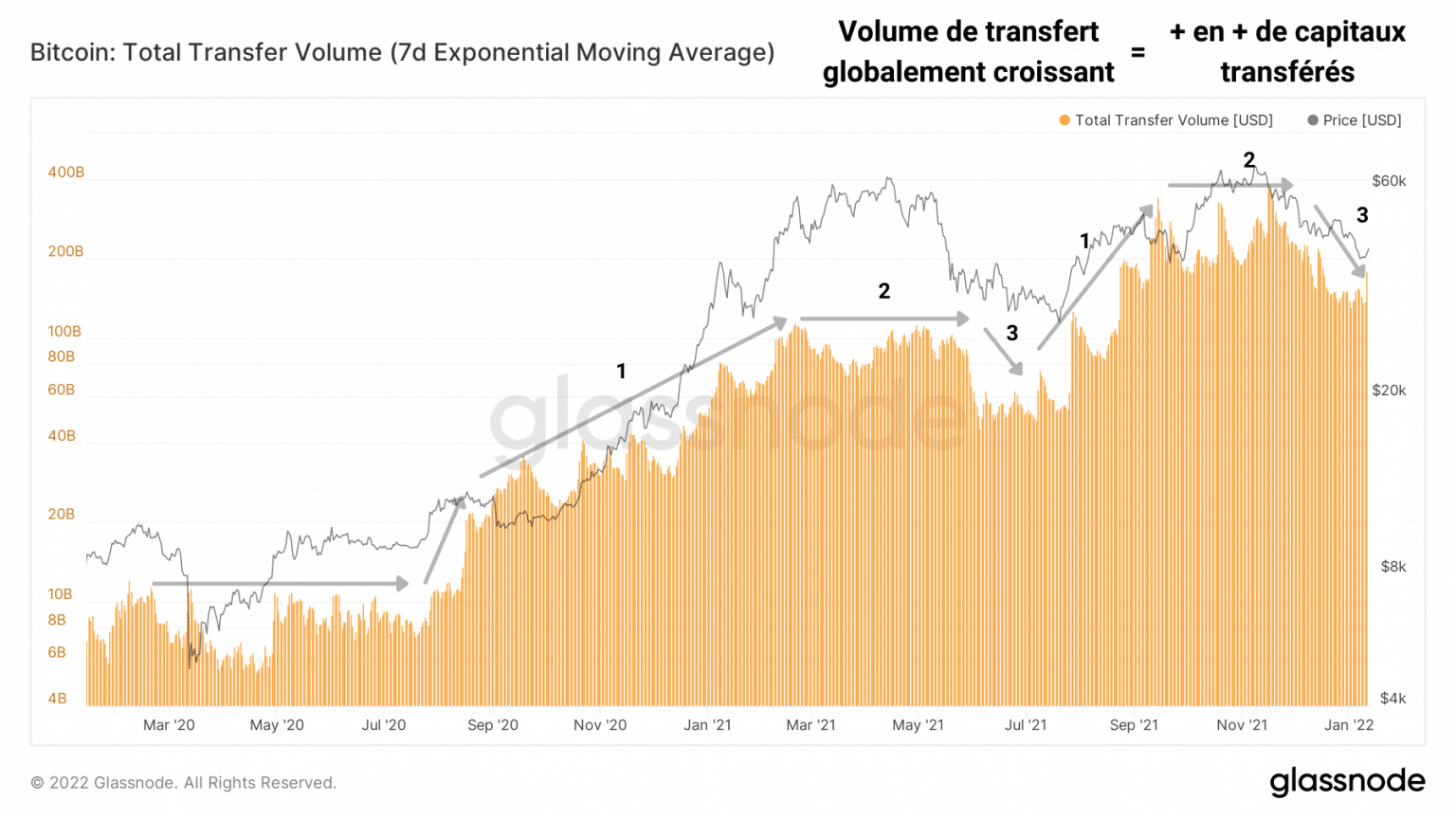
Bitcoin (BTC) transfer volume graph (Source: Glassnode)
So, while the number of incoming and active participants is small compared to previous cycles, the Bitcoin network is experiencing fewer, but larger transactions.
Exchange flow
Let’s conclude this broad study by looking at the flows of centralized exchange platforms. Reflecting the overall sentiment of participants, their fluctuations allow us to identify the psychology at play during market phases.
As we have seen in our previous analyses, exchange reserves have maintained a downward trend since the March 2020 paradigm shift.
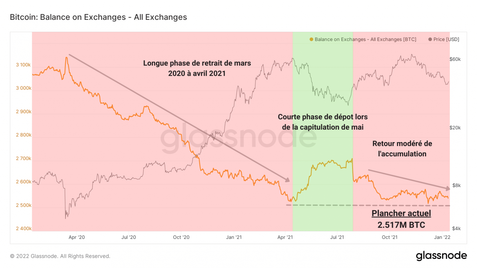
Trade Reserves Chart (Source: Glassnode)
However, it seems that this curve has formed a medium term floor at the 2.51 million BTC level that the current accumulation is not sufficient to break through at the moment.
Adding more detail to our prism, the net change in trade position shows withdrawal phases in red and deposit phases in green.
Having experienced an overall dominance of outflows, we can however notice a deposit phase in November, when some LTHs distributed some of their tokens in order to make their profits.
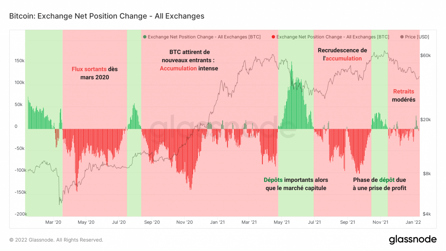
Chart of net change in trading position (Source: Glassnode)
This was followed by a moderate recovery in accumulation from early December, despite a correction of over 35% since the new ATH of $69,000.
That said, as mentioned by Data Always, these metrics can be noisy and are often misunderstood by analysts.
“It’s not uncommon to see a chart showing falling exchange reserves and then be told that the supply of tokens will soon run out and prices will rise. There is some truth to that, but the story is much more complicated. “
In fact, during a bull market, the inflow of trades is highly correlated to the price of bitcoin.
Simply put: when the price rises, people who have been holding bitcoins for a long time have an incentive to realize their profits.
They therefore tend to transfer their tokens to an exchange platform in order to sell them to newcomers.
Thus, if the price drops, the incentive to sell decreases and these players are less likely to sell their coins.
The graph below shows the 90-day correlation between exchange flows and the daily change in the price of bitcoin.
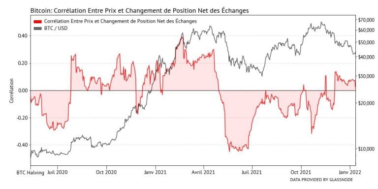
Graph of the correlation between the price of Bitcoin and the net position change of exchanges (Source: Data Always)
During bull markets we tend to see high or no correlation between changes in trade reserves and price, whereas during panics we see huge price drops and very strong negative correlations between price and trade flows.
Using this correlation, we can determine the health of spending without going through profitability dynamics by identifying two antagonistic phases.
In blue are the periods when the price-flow correlation is positive. Signs of a healthy market, they mean that players are selling during upturns and holding on during corrections.
Conversely, periods in which participants sell during declines and do not make a profit during increases are shown in yellow.
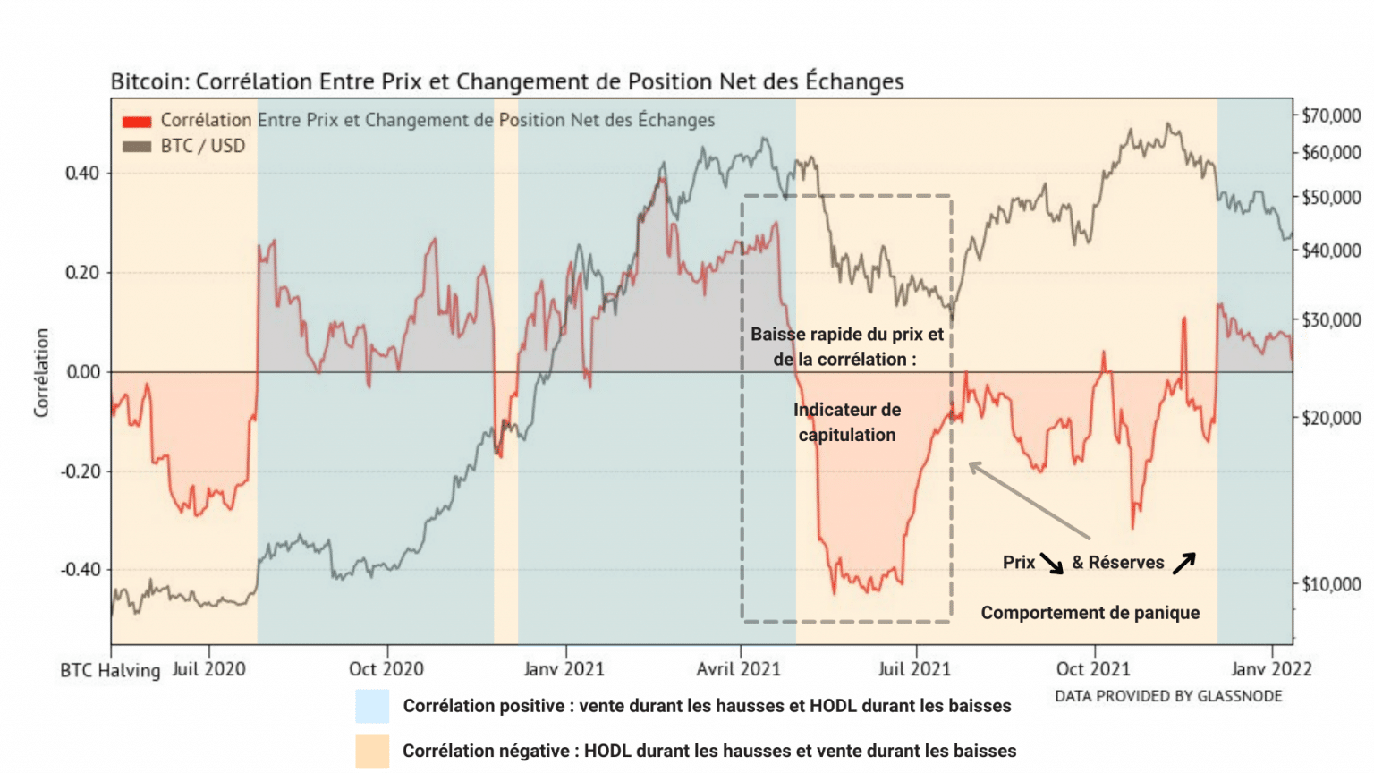
Graph of the correlation between the price of Bitcoin and the net position change of exchanges (Source: Data Always)
We can then see that the market took six months to resume proper spending behaviour after the May capitulation.
The new blue phase, which began in early December with the rapid fall in price following a leverage purge, indicates that participants are holding their ground during the downturn and acting in a rational and healthy manner.
Synthesis
Overall, it appears that the Bitcoin network is not operating at full capacity. Although few participants are active and newcomers are slow to arrive, the use of the chain is allowing more and more funds to flow.
The flows of the exchanges indicate that the paradigm of store of value and accumulation is still present and is pushing the reserves of the exchanges to be gradually emptied. The in-depth analysis of the price-flow correlation nevertheless points to the fact that the market has only just returned to a healthy spending behaviour.