
The cryptocurrency market is off to one of its best starts in 14 years with Bitcoin up 28% and Ether (ETH) up 31%. This first part of January’s bull market is fuelling the debate about whether the bear market that has been in place since November 2021 will end. Here are two charts that you need to know about to participate in this debate.
The relative strength between Bitcoin and the Wall Street equity market
It’s been an almost unexpected start to the year for the crypto-currency market as it was so caught up in the trust implications of the FTX case. While the equity market had been on a strong rebound since last October and the US dollar was giving up more than 11%, the total crypto market capitalisation was sinking against the backdrop of capital outflows from centralised platforms.
The strong bullish start to the year for cryptos (+28% for the bitcoin price and +31% for the ETH/USD rate) is therefore making up for the lag on other risky assets in the stock market and erasing the bearish effects of the fall at the beginning of last November.
But is this enough to argue for the end of the bear market that has been in place since November 2021? Note that for some, the bear market started in the spring of 2021 with the first bullish reversals on interest rates in the credit market.
Indeed, the market’s rise from $16,000 to $21,000 sees the first breach of resistance in over 15 months, accompanied by a bullish reversal in various measures of volume, commitment and participation (mirroring the asset under management rebound of the world’s first crypto ETF, BITO).
This is certainly not a new bull run, given the very high level of fundamental uncertainty, but I think it is fair to say that the bear market has neutralized itself. The challenge now is to show that the $19,000/$20,000 price zone has recovered its support status, as breaking this zone again would be proof that the market has only experienced a dead cat bounce.
On the side of the argument for the end of the bear market, there are many active bullish divergences in weekly data, like the one on the Bitcoin/S&P500 ratio.
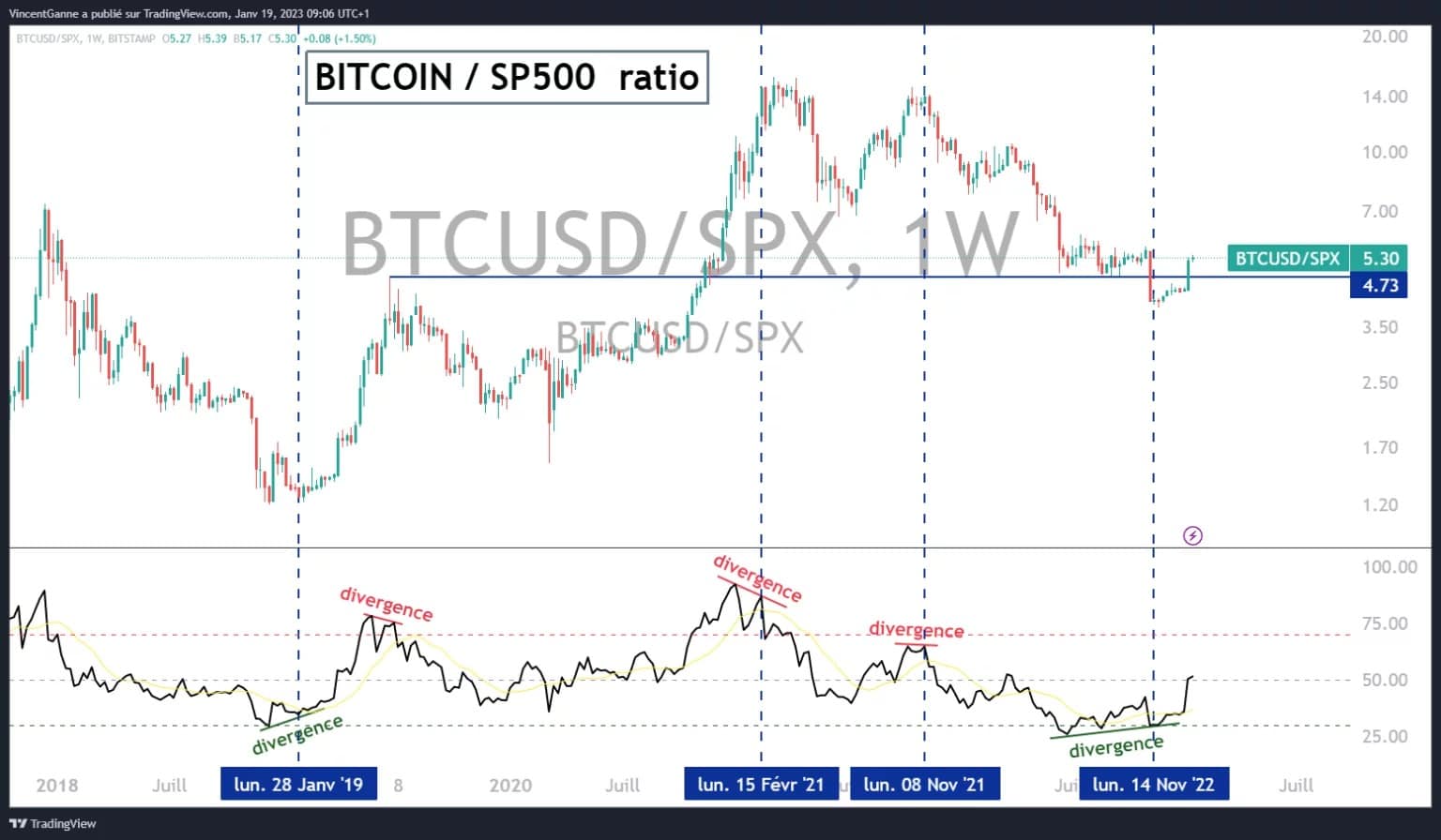
Chart that reveals the relative strength ratio between the US equity market and the bitcoin price (the US equity market being represented by the S&P 500 stock index)
Bitcoin’s drawdown percentage curve against its former ATM
Let’s pay tribute to the price/momentum technical methodology, as there were many bullish technical divergences between the price action and its first derivative for the past few weeks. If you watch my videos every Tuesday, I use the RSI technical indicator to represent the market’s momentum, i.e. its underlying speed. So these bullish divergences have produced their technical bounce effect, I show you a very relevant one on the chart below.
This chart shows the weekly curve (the points update at the end of each week, so this chart has a medium/long term range) of the percentage drop in the bitcoin price since its former all-time high (ATH). On this chart you can see a superb bullish divergence with the RSI technical indicator, here too it has perfectly produced its bullish effect with the 28% rebound in BTC.
In order to give more validity to these divergences, we would now need to see BTC break out of resistance at $21,500, the price level before the FTX collapse.
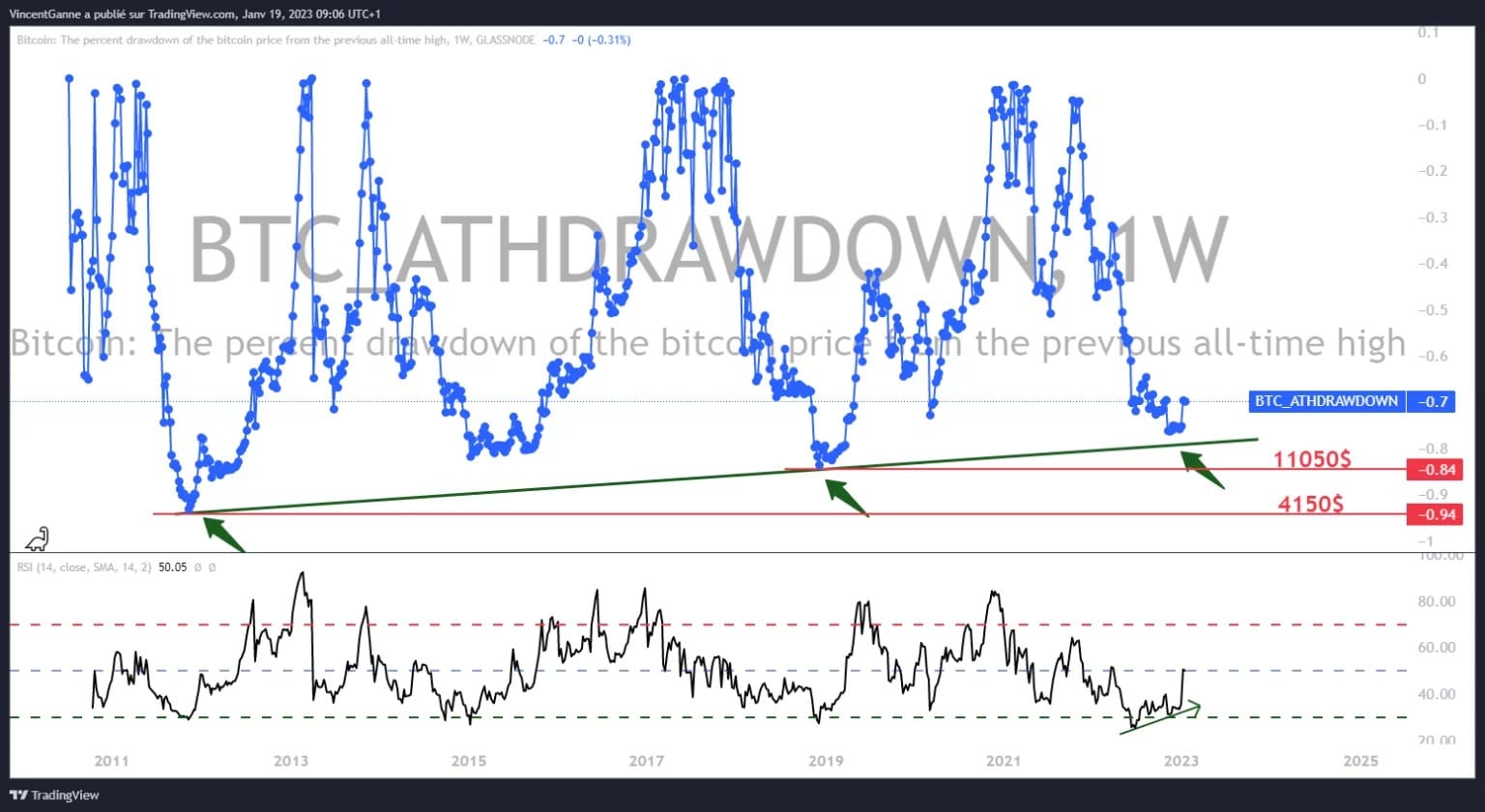
Chart that exposes the percentage drawdown curve of the Bitcoin price since its former all-time high